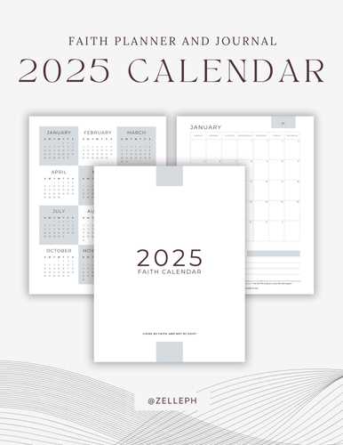
Creating a personalized and visually appealing design for managing your year is an essential part of staying organized. Whether you are planning personal milestones, business schedules, or seasonal events, having a clear structure can make a significant difference in how you manage your time. With the right tools, anyone can craft a design that suits their needs and aesthetic preferences, bringing both functionality and style to their daily routine.
Crafting a unique yearly planner requires more than just filling in dates. It’s about building a framework that not only organizes time but also reflects your personal or professional brand. By leveraging creative tools, users can choose from various styles and layouts, from minimalist and modern to more intricate and decorative patterns. The flexibility of design ensures that the final outcome is tailored precisely to your goals.
Working with digital design software opens up countless possibilities to modify and adjust every detail, from color schemes to font choices, making it easy to adapt a layout for any occasion or purpose. Whether you want a simple grid or a more elaborate design, the creative freedom offered by these applications ensures that you can achieve the look you envision, with just the right amount of customization to match your vision for the year ahead.
How to Create a 2025 Calendar in Photoshop
Designing a yearly planner from scratch offers complete control over its layout, style, and functionality. By starting with a blank canvas, you can tailor each month’s layout, incorporate unique design elements, and ensure that all important dates are clearly visible. This method also allows for personal customization, whether it’s for professional use or a personalized gift. Here’s a step-by-step guide on how to create a visually appealing and practical planner for the upcoming year.
Follow these instructions to create your own custom planner:
- Set the Document Size: Open your design software and create a new project with a size suitable for printing, such as 8.5 x 11 inches for a standard paper size. Make sure to set the resolution to 300 pixels per inch for optimal quality.
- Divide the Space for Each Month: Use the grid tool to divide the workspace into twelve sections–one for each month. These sections will help you maintain consistency and alignment across all months. You can use the ruler and guides to make the process easier.
- Design the Layout: Begin designing the structure for each section. Typically, each month has a title with a list of days arranged in a grid. Consider adding holidays, special dates, and space for notes. Use your creativity to add a background or embellishments that align with the theme of the planner.
- Add Text for Days and Dates: Using the text tool, label the days of the week and fill in the corresponding dates for each month. Double-check that the days match the correct dates for the year, ensuring everything is accurate.
- Incorporate Images or Icons: Enhance the planner by adding visual elements such as illustrations, icons, or photographs. These can represent seasonal changes or reflect personal preferences. For example, you could include winter imagery for the first months and more vibrant designs for the summer months.
- Refine and Finalize: Once all months are set up, review the layout for any inconsistencies. Ensure that the design is clean, easy to navigate, and visually balanced. You can make adjustments to fonts, colors, and spacing to ensure everything aligns perfectly.
Once you’re satisfied with your design, save the project file in a format suitable for printing or sharing. Now, you have a fully customized yearly planner that’s ready to be printed or used digitally! Whether for personal organization or a unique gift, creating your own design gives you flexibility and a personal touch.
Customizing Your Calendar Template in Photoshop
Creating a personalized visual layout for your yearly planner can be a rewarding task. By using advanced tools in a graphic editing program, you can adjust every element to fit your specific needs. Whether it’s changing the design, adding personal photos, or adjusting the layout, the process can be both fun and functional. In this section, we will explore how to modify and enhance your planner layout to make it truly unique.
Changing the Layout and Design Elements
One of the first steps to making your project unique is to modify the overall structure. Start by adjusting the grid and layout to match your preferred style. You can change the size of text boxes, alter the spacing, or even reposition the different sections. If you want to add a more modern look, consider using bold fonts and vibrant colors that align with your personal aesthetic. The ability to manipulate each element gives you full control over the final result.
Adding Personal Images and Artwork
To further personalize your creation, consider incorporating your own photos or digital artwork. This can range from family pictures to inspirational quotes or illustrations that match the theme of your year. Simply insert your image into the design, and use the layer options to adjust its size, opacity, and positioning. Using custom visuals not only enhances the look but also makes the final product more meaningful to you.
By using these simple techniques, you can create a truly one-of-a-kind yearly planner that reflects your personality and style.
Choosing the Right Dimensions for 2025
When creating a design intended for printing or digital use, selecting the appropriate size is crucial for both aesthetics and functionality. The proportions of your project can influence how it will be perceived and interacted with, whether it’s for personal use or a more professional distribution. Different formats offer various advantages depending on the medium and purpose.
Size matters not only in terms of space but also in ensuring the best quality for different types of output. From posters to small handouts, the right measurements can enhance the visual appeal, readability, and user experience. Consider how the end product will be used–whether it’s going to be displayed on a wall, viewed on a digital screen, or handed out in a physical format.
In addition to choosing the right size, it’s important to think about resolution and pixel density, especially for projects intended for high-quality printing. A higher resolution ensures that your design looks crisp and clear, even at larger sizes. On the other hand, digital projects might have specific size requirements depending on the device or platform where they will be viewed. Keeping these factors in mind will help ensure your creation stands out and serves its intended purpose effectively.
Working with Pre-made Calendar Templates
Using pre-designed layouts can significantly streamline the creation of time-management tools for personal or professional use. These ready-to-use structures provide a solid foundation, allowing you to focus on customization rather than starting from scratch. Whether you’re designing for a business, event, or personal project, these designs are versatile and can be adapted to various needs.
One of the main advantages of working with pre-built designs is the time-saving aspect. With most of the structural elements already in place, you can quickly adjust text, colors, and other design aspects to match your preferred style. This is particularly helpful for those who may not have advanced design skills but still want to produce a polished and functional outcome.
Customization is key in this process. While the base elements are set, you have the freedom to tweak every detail–from font choice to background imagery. This flexibility ensures that the final product will reflect your unique vision, whether it’s for a corporate campaign or a personalized gift.
Additionally, these designs often come with layered files, which provide ease of editing and help maintain clarity when making adjustments. Working with such files can be especially useful when you need to update or modify sections on a regular basis, as it reduces the effort required for future edits.
Designing a Calendar from Scratch
Creating a personalized layout for organizing time can be a rewarding project. This process involves setting up a visual structure that helps users manage their schedules efficiently while reflecting a unique design style. By choosing appropriate elements, colors, and typography, you can craft an attractive and functional system to keep track of days, weeks, and months.
Start with a Solid Framework
Begin by outlining the basic grid that will house the days and weeks. The layout should be clear and easy to navigate. Typically, a weekly view or monthly blocks work best, depending on the purpose of the design. Keep in mind that a well-balanced structure enhances both the readability and overall aesthetic of the final product.
Choose a Color Scheme and Style
Select colors that complement each other and provide clear contrast between different sections. This ensures that each part is easy to distinguish, making it more user-friendly. The style can range from minimalist to intricate, depending on your audience and the tone you wish to set.
Incorporate Customization Features
Adding personalized touches–such as spaces for notes, important dates, or even motivational quotes–can greatly enhance the utility and appeal of the design. Customization options allow users to tailor their experience to their individual needs and preferences, making the layout more engaging and functional.
Final Touches
Once the structure and design elements are in place, fine-tune the spacing, margins, and alignment. Ensuring everything is perfectly arranged gives the project a polished, professional finish. The final result should be both aesthetically pleasing and practical, offering an easy-to-use tool for tracking time.
Importing and Editing Photos in Your Design
Incorporating images into your creative project allows you to enhance the visual appeal and convey a stronger message. To achieve the best result, it’s important to understand how to seamlessly integrate and modify your pictures within the layout. This process can help you create a design that stands out, whether you’re working with personal photographs, stock images, or custom graphics.
Bringing Images into Your Project
The first step in using visuals is importing them into your working file. Once the images are in place, they can be adjusted and positioned to fit your design goals. Here’s how to import and organize your pictures:
- Locate your image files on your computer or an online source.
- Use the file menu to import your selected images into the workspace.
- Ensure the imported visuals are placed on the correct layers for easy manipulation.
Editing and Adjusting Your Images
Once your images are in the design, you may need to make some adjustments to ensure they complement your overall concept. Editing allows you to refine colors, shapes, and sizes, as well as add effects that suit the style you’re aiming for. Here are some common adjustments you can make:
- Resize and crop images to fit specific spaces within your layout.
- Adjust brightness, contrast, and saturation to match the mood of your design.
- Apply filters or effects to give your visuals a unique look.
- Manipulate image layers for better positioning and blending with other elements.
Mastering the art of photo integration and modification will significantly improve the quality of your final creation, ensuring that the images complement the overall design. Experiment with different settings to find the perfect combination for your project.
Adding Text to Your Layout
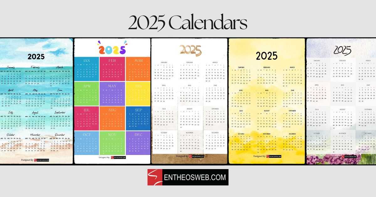
Incorporating text into your design is essential for providing context, conveying important information, and enhancing the overall aesthetic of your project. Whether you’re marking significant dates, labeling sections, or simply adding a decorative touch, careful placement and styling of the text can greatly impact the visual appeal and functionality of your layout.
Choosing Fonts is one of the most crucial decisions when adding textual elements. The right font can make your design feel cohesive, while the wrong one can make it look disjointed. Opt for fonts that align with the theme and purpose of your creation, ensuring readability and visual harmony. Combining different typefaces can work well, but avoid using too many to prevent visual clutter.
Text Placement is just as important as the choice of typography. Consider positioning your words in a way that flows naturally and doesn’t overcrowd the space. You can position key information in prominent spots, while less important details can be placed subtly to keep the layout clean. Utilizing grids or guides can help ensure that the text is aligned properly and that there is enough breathing room around each element.
Adding Details such as dates, titles, or inspirational quotes can bring life to your design. Don’t be afraid to experiment with different sizes and weights to draw attention to specific text. Highlighting important information through contrasting colors or bold fonts can help guide the viewer’s eye to key points, while softer styles can balance the composition.
Lastly, be mindful of contrast and readability. Text should be legible against any background, so choose contrasting colors or use effects like shadows or outlines when necessary. This will ensure that your message stands out clearly, no matter the context or medium.
Incorporating Holidays into Your Calendar
When designing your yearly planner, adding holidays can make it not only more functional but also aesthetically pleasing. These special days are often moments of celebration, reflection, or rest, and their inclusion can help create a more personalized and meaningful layout. Whether it’s marking national observances or personal milestones, integrating these occasions allows for better organization and planning throughout the year.
Highlighting Key Events
One of the most effective ways to mark special dates is by making them stand out visually. Use bold colors, different fonts, or icons to ensure important celebrations are immediately noticeable. For instance, you could highlight festive occasions with a vibrant hue or a distinct shape, drawing attention to significant moments. This helps in visually distinguishing these dates from regular days, making it easier to plan around them.
Personalizing Special Days
In addition to public holidays, consider adding personal dates that hold meaning, such as birthdays, anniversaries, or special events. These dates can be marked with unique symbols, custom images, or even motivational quotes to make the design more engaging. By incorporating a mix of official holidays and personal milestones, your planner will feel more connected to your life, increasing its functionality and appeal.
Creating a Minimalist Calendar Design
Minimalist designs emphasize simplicity and functionality, focusing on essential elements while eliminating unnecessary details. When approaching the creation of a visual layout for time management, the goal is to develop something clean, easy to read, and visually appealing without overwhelming the viewer with excessive graphics or complex structures. The aim is to convey important information in a straightforward and elegant way, ensuring clarity and usability.
Key Principles of Minimalism
To achieve a minimalist look, certain principles need to be followed:
- Use of White Space: Ensure that there is enough breathing room around elements to avoid a cluttered feel. The negative space helps the content stand out.
- Limited Color Palette: Stick to two or three primary colors that complement each other, keeping the design visually simple and organized.
- Simple Typography: Choose clean, easy-to-read fonts that are consistent throughout the layout.
- Grid Layout: A grid system can help organize the elements in a structured way, giving balance and harmony to the design.
Designing the Layout
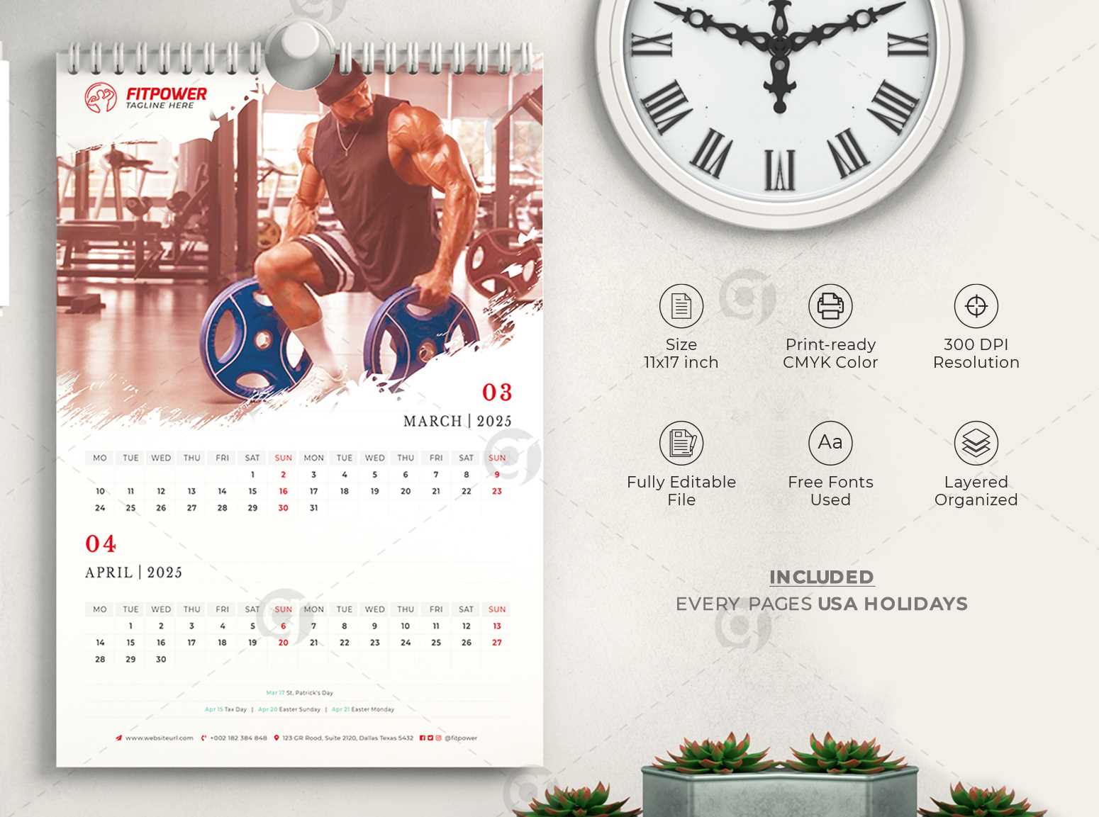
The layout should be carefully structured to ensure all the necessary components are easy to locate and understand. Consider the following steps:
- Choose the Right Size: Determine the size of your layout based on where it will be displayed. A standard design might be A4 or a larger format for wall use.
- Focus on the Core Information: Include only the essential details such as days, months, and week numbers. Avoid overloading with additional information that might distract from the main focus.
- Utilize Simple Icons: Instead of large illustrations, opt for small, simple icons to mark significant dates or events.
- Ensure Visual Hierarchy: Prioritize the most important elements, such as the current month or dates, making them larger or bolder. Use varying font weights or sizes to guide the viewer’s attention.
By focusing on these principles and steps, you can craft a clean, functional design that promotes both aesthetic appeal and practical use.
Using Layers Effectively in Photoshop
Working with different elements in a design can quickly become overwhelming, especially when various components need to be adjusted individually. The key to managing complex compositions is organizing and controlling each piece separately. By using layers properly, you gain more flexibility and precision in your workflow, allowing for non-destructive editing and easier modifications.
Understanding Layer Basics
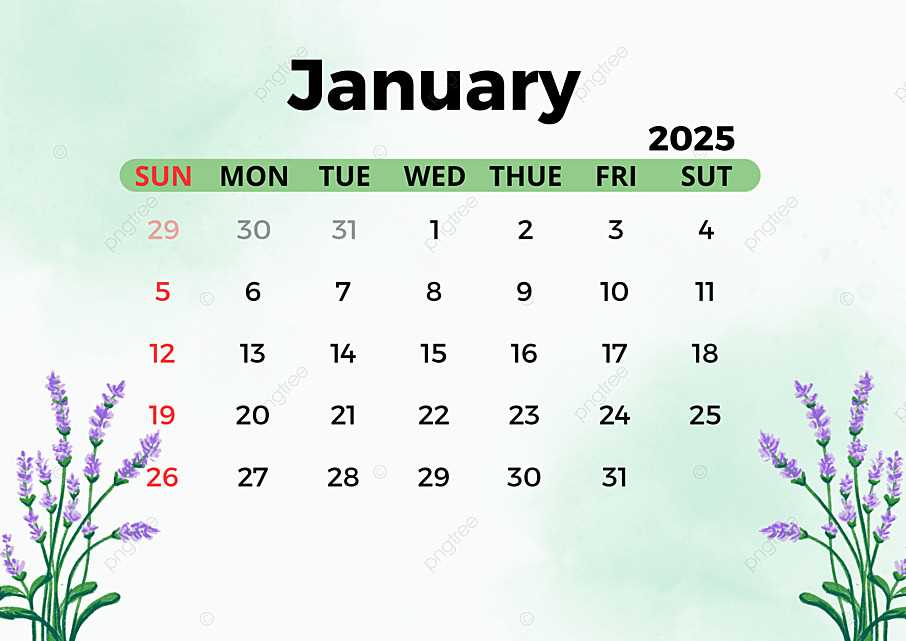
At its core, a layer is simply a level in a project where individual elements are placed. Each layer acts as a separate sheet, allowing you to work on one part of the design without affecting others. This structure provides immense control, as you can hide, reveal, or adjust the opacity of specific elements without altering the rest of the image. Mastering the basic functions of layers, such as renaming, locking, or grouping, is essential for efficient design management.
Advanced Layer Techniques
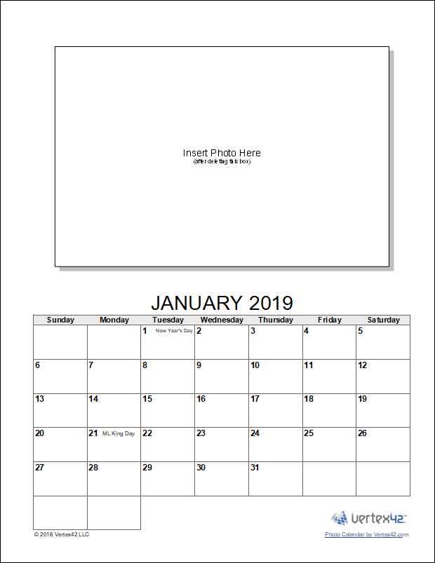
Once you’re comfortable with the basics, advanced techniques can help enhance your workflow. Layer effects, such as shadows, glows, and bevels, can give your designs depth and dimension without permanently altering the original content. Utilizing adjustment layers allows you to modify colors, contrast, or brightness non-destructively, maintaining the flexibility to tweak your design at any stage. Moreover, combining multiple layers into groups helps in organizing and simplifying complex projects, ensuring that you can focus on specific sections without distractions.
Adjusting Fonts for Calendar Readability
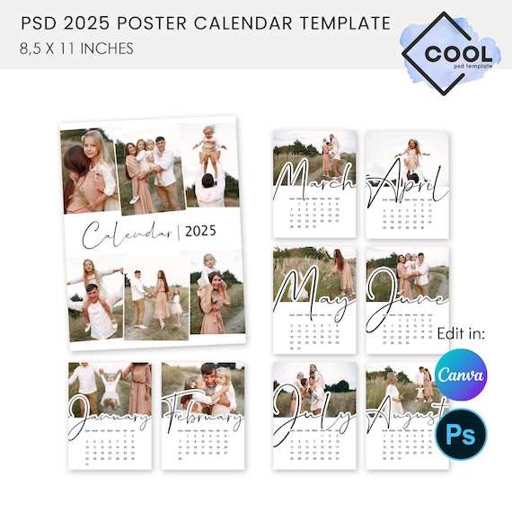
Choosing the right typography for a visual schedule is crucial for ensuring clarity and ease of use. Properly selected fonts not only enhance the aesthetic appeal but also contribute significantly to how quickly and effectively users can interpret dates and events. By focusing on legibility, hierarchy, and consistency, you can create a design that is both functional and visually pleasing.
Font Size and Spacing
One of the primary considerations when selecting fonts is their size and the spacing between characters and lines. A font that is too small may cause strain on the eyes, while one that is too large can disrupt the overall layout. Optimal spacing between letters (kerning) and lines (leading) ensures that the text remains readable, even when the viewer glances quickly at the design.
Font Style and Weight
It’s essential to balance style and functionality when choosing a font for your visual schedule. Sans-serif fonts often provide better clarity at smaller sizes, making them ideal for practical uses. Additionally, selecting the right font weight, whether bold for emphasis or regular for general text, creates a hierarchy that guides the viewer’s attention to the most important information first.
Integrating Custom Graphics and Icons
When creating a personalized design project, incorporating unique visuals such as illustrations, symbols, and decorative elements can significantly enhance the overall appeal. These graphical components not only add a distinct touch but also align the project with a specific theme or brand identity. The process of integrating such visuals requires a balanced approach to ensure that each design element contributes cohesively to the entire composition, without overwhelming the viewer or disrupting the layout.
Choosing the Right Visuals
Selecting the appropriate graphics and icons plays a critical role in achieving a polished and professional look. Custom visuals should complement the overall aesthetic, whether you’re aiming for a minimalistic design, vintage appeal, or a vibrant, contemporary feel. Icons, for example, can serve as visual cues to guide the viewer’s attention to important information, while illustrations can provide personality and flair to the project.
How to Properly Integrate Graphics
Proper placement of graphics is key to maintaining visual harmony. While it’s tempting to use several decorative elements, it’s important to avoid overcrowding the layout. Icons should be strategically placed next to text or other key content to enhance comprehension, while images should not overpower the surrounding components. Consistency in color scheme, style, and size ensures that the entire design feels integrated rather than fragmented.
| Graphic Type | Best Use Case | Considerations |
|---|---|---|
| Icons | Highlighting important features or actions | Keep it simple and consistent in size |
| Illustrations | Adding personality and visual interest | Ensure they align with the overall theme |
| Textures | Creating depth and layering | Avoid excessive use to maintain clarity |
Color Palettes for Calendar Design
Choosing the right color scheme is crucial for creating an engaging and visually appealing design. The right palette not only enhances the overall aesthetic but also sets the tone and mood for each section. Effective use of colors can guide the viewer’s attention, evoke emotions, and complement the theme of the design.
When selecting colors, it’s important to consider both harmony and contrast. A well-balanced combination ensures that the design is pleasant to the eye, while contrasting elements help important details stand out. Here are a few suggestions for building strong color schemes:
- Monochromatic Schemes: Using variations of a single color creates a clean and cohesive look. This is perfect for designs that require a minimalist or professional touch.
- Complementary Colors: Pairing colors from opposite sides of the color wheel creates high contrast and vibrant designs. This is great for making certain elements pop.
- Analogous Colors: Selecting colors next to each other on the wheel provides a harmonious and serene effect. This is ideal for designs that need to feel calm and balanced.
- Neutral Palettes: A mix of black, white, and gray can give a modern and sophisticated look. This type of palette allows for more focus on typography or graphic elements.
Experimenting with different combinations and paying attention to the psychological effects of each color will help achieve the desired impact. Whether you aim for a bright, energetic feel or a more subdued, elegant appearance, the right color choices can transform a simple layout into an eye-catching design.
Adding Week Numbers to Your Calendar
Incorporating week numbers into your scheduling layout can greatly enhance its functionality, helping users track and manage time more effectively. This feature is particularly useful for professionals, educators, and anyone who needs to reference specific weeks quickly. It offers a clear numerical reference for each week of the year, simplifying planning and organizing tasks.
There are various ways to integrate week numbers, and the approach depends on the software you are using. Below are the common methods to add week numbers to your layout:
- Automatic Week Numbering: Some programs include built-in options to automatically generate week numbers for each week in the year. This feature can be easily activated, saving time and effort.
- Manual Input: For greater control, you can manually add week numbers beside the dates. This allows for custom formatting and precise placement according to your design preferences.
- Using Scripts or Plugins: If the default tools do not provide an automatic way to add week numbers, consider using scripts or third-party plugins that streamline the process.
Each method can be customized to suit your needs, and integrating this feature ensures that your layout remains functional and organized. Whether you’re creating a professional planner or a personal organizer, week numbers will help improve the overall efficiency of your time management system.
Exporting Your Final Calendar for Printing
Once you’ve finished designing your project, it’s time to prepare it for professional printing. The export process ensures that your work maintains the highest quality when transferred from your digital workspace to physical media. This step is crucial for preserving the sharpness of your images, the accuracy of colors, and the correct alignment of all elements, regardless of the type of paper or printer being used.
Choosing the Right File Format
For optimal results, selecting the proper file format is essential. The most commonly used file types for high-quality printing are TIFF, PDF, and JPEG. TIFF files are known for their lossless compression, ensuring no detail is lost during export. If you need to preserve layers and additional elements for future editing, PDF offers a flexible solution. JPEG, while compressed, can still deliver excellent quality for standard printing, especially if file size is a concern.
Adjusting Resolution and Color Settings
Ensure that your project is set to a resolution of at least 300 DPI (dots per inch) for print quality. This resolution guarantees sharp details and clear text. Additionally, it’s important to use the CMYK color model instead of RGB, as it is optimized for print. By converting to CMYK, you reduce the chances of color discrepancies between your screen and the final print output.
After exporting your file, it’s advisable to check the preview to confirm all elements appear as intended. Make sure there are no unwanted artifacts, color shifts, or alignment issues before sending it off to be printed.
Best File Formats for Calendar Output
When preparing a design for print or digital use, choosing the right file format is crucial for ensuring the highest quality and compatibility across various platforms. Different file types offer distinct advantages, such as resolution, color accuracy, and ease of editing. Selecting the appropriate format depends on the intended purpose and whether the end result is a printed item or a digital display.
Raster Formats: JPEG and PNG
Raster formats like JPEG and PNG are commonly used for designs intended for screen viewing. JPEG is ideal for images with a wide range of colors and gradients, providing a smaller file size. However, it uses lossy compression, which can slightly reduce quality. On the other hand, PNG supports transparency and offers lossless compression, making it perfect for designs that require sharpness and clear backgrounds, though it may result in larger file sizes.
Vector Formats: PDF and SVG
Vector formats are often preferred for printed designs due to their scalability without loss of quality. PDF is a versatile format that supports both vector and raster graphics, making it suitable for high-resolution printouts. SVG, a purely vector-based format, ensures crisp details at any size and is ideal for use on websites or in applications that require precise graphics. These formats maintain high clarity, regardless of the dimensions, and are often used for professional-quality prints.
Tips for Ensuring a High-Quality Print
When preparing your design for printing, it’s essential to consider several factors that can affect the final output. High-quality results depend not only on the design itself but also on the settings, resolution, and paper type chosen for the job. Whether you’re working on a marketing piece, a personal project, or any other print material, these guidelines will help ensure your work appears sharp, vibrant, and professional when printed.
1. Choose the Right Resolution
- For sharp and clear prints, always use a resolution of 300 DPI (dots per inch). Lower resolutions can result in pixelated or blurry images.
- If your design includes photographs or intricate details, make sure each element is high resolution to maintain clarity.
- Keep in mind that web images are usually set at 72 DPI, so resizing these images for print without adjusting resolution can lead to poor quality.
2. Adjust Color Settings
- Ensure you’re working in the correct color mode, typically CMYK for printing. RGB is meant for screens and can produce unsatisfactory results on paper.
- Consider color calibration if you are using different devices to design and print, as color discrepancies between screens and printers are common.
- Perform a test print to check if the colors on the screen match what you see in the print. Minor adjustments may be necessary before the final print run.
3. Select the Right Paper
- The paper type can significantly impact the final output. Glossy paper produces vibrant colors, while matte paper provides a more sophisticated, subtle look.
- Consider the weight of the paper–heavier paper tends to convey higher quality and durability.
- Test different paper finishes (smooth, textured, or coated) to see how they affect the appearance of your design.
By following these tips, you’ll be able to produce print materials that are not only visually appealing but also professionally executed. Always review your design before sending it to print and consider printing a small sample to ensure everything looks as expected.
Sharing Your Photoshop Calendar Design Online
Once you have finalized your creative design, it’s time to share it with others. The internet offers various platforms and methods to showcase your work, whether you’re looking to share it with friends, clients, or a broader audience. From social media to print-on-demand services, there are several options to distribute your design and allow others to enjoy or use it. The key is choosing the right format and platform to match your goals, whether that’s for personal enjoyment or commercial distribution.
One of the first steps is converting your design into a file format that is both accessible and high-quality. Most platforms, whether for social sharing or online sales, prefer formats like JPEG, PNG, or PDF. These file types maintain the integrity of your design while ensuring that others can view or print it without issues. It’s important to consider the resolution and ensure your design looks crisp across different devices and print mediums.
Next, you can upload your creation to a variety of online channels. For personal sharing, platforms like Instagram, Pinterest, or Facebook allow you to quickly reach your social circles. For more professional or commercial purposes, consider platforms like Etsy or your own website. These spaces enable you to connect with a targeted audience who may be interested in purchasing or downloading your work.
Additionally, you can offer your design on platforms that allow others to personalize or modify it, which could be appealing to those seeking custom designs. By making your work available for download or print, you not only showcase your creativity but also open the door to potential collaborations or sales opportunities.
Remember to protect your work if necessary. Adding watermarks, using file encryption, or including terms of use can help safeguard your designs from unauthorized usage. Whether you’re sharing your creation for free or as part of a commercial offering, being mindful of copyright and licensing is crucial to maintain control over how your work is used.